Case Studies

Eight selected projects. Each one names the problem, the decision I made and what I rejected, and the evidence supporting each decision.

Case Study 1 — Does Adding Video Actually Help?

A controlled study of short supplementary instructional videos in an asynchronous online graduate course.

The problem

Every instructional designer I know has been asked the same question by a client — should we add video? It is an expensive question to answer badly, because video costs money to produce, time to produce well, and once it exists somebody has to caption it, host it, keep it current, and eventually replace it. I had opinions about the answer, and no evidence, and neither did most of the people around me.

So, I created an independent study and narrowed the question until it was small enough to test. In an asynchronous online graduate course with no instructor present, does adding short instructional videos change student engagement, satisfaction, or performance?

The decision

I built two versions of the same four-module networking course. The control version was text-only, and the treatment version was identical in every respect except that each module carried a short video summarizing its content.

The specification is what made this a study rather than an anecdote. I did not produce the videos to my own taste. I derived a specification from the research first, then held every video to it — three to six minutes, one video per module, one main idea per slide, narration that summarizes the module rather than reading the text aloud, visual signaling on the key ideas, one or two embedded reflection questions, captions enabled, and an identical structure across all four.

Generative AI carried part of the workflow under a published declaration, deriving the design checklist from five research articles, drafting the slide outlines and narration against it, preparing an IRB-ready consent form, generating assessment items, and running the preliminary analysis.

The proof

Participants consented, were assigned to a group, completed the course and its assessments, and completed two surveys. Behavioral engagement came from quiz scores, completion time, and final examination scores, and attitudinal data from adapted Online Student Engagement and eLearning Student Satisfaction instruments, both reliable at Cronbach’s alpha of 0.85 and 0.81. I ran Welch’s t-tests with Cohen’s d, plus a thematic analysis of field notes and interviews.

The video group reported higher satisfaction, and their engagement appeared higher as well. Participants told me plainly that multimedia is expected in a modern online course and that its absence signals a subpar one. The video group also scored lower on the module quizzes, and final examination scores came out close to even.

That result is the most useful thing this study produced. One interpretation is that a summary video can substitute for reading rather than reinforce it, so a learner who watches instead of reading may feel more satisfied while knowing less. It is why I now advise clients that video earns its place when it sends learners back into the material rather than standing in its place. If I ran the study again, I would keep the videos exactly as specified, add a required retrieval task immediately after each one, and watch whether the quiz gap closes.
Study presentation (9:54). Captions are available in the player.
One of the module summary videos from the treatment course (1:53). Captions are available in the player.

Case Study 2 — Catching a Struggling Student Before the Withdrawal

Building affect detection models from classroom observation data and choosing the metric that matters over the metric that flatters.

The problem

By the time a student tells you they are struggling, they have usually been struggling for weeks, and technology-mediated environments make this harder, because the signals a teacher reads in a room — the frown, the disengaged posture, the third attempt at the same problem — are not available in the same way. Modern learning environments do collect data throughout the learning experience, so the real question is whether that data can identify a frustrated, bored, or confused student early enough for somebody to intervene.

In this project, I worked with classroom interaction data paired with trained observers’ affect labels, collected in twenty-second intervals across four states — frustration, confusion, boredom, and concentration — and built the best detector I could for each one.

The decision

I inspected the data first. Over ninety percent of the labels were missing, which twenty-second windows predict, and the labels that existed were badly imbalanced, with frustration roughly 96 percent false, confusion similar, and concentration about 82 percent.

That imbalance sets a trap, so I ran a majority class model first, deliberately. On frustration it scored 96.25 percent accuracy, a Cohen’s kappa of 0, an area under the curve of 0.5, and a recall of 0 percent. It reached 96 percent accuracy by predicting that no student is ever frustrated. That baseline is the most useful thing in the project, and it is why accuracy should never be the first number in a report on an imbalanced problem. I evaluated on six metrics instead — kappa for performance above chance, area under the curve for class separation, and precision, recall, and F1 for the cases that matter.

Next I built five models for each affect, twenty in total, all under cross validation split on the dataset’s own fold attribute so that related observations could not leak between training and test. Five feature engineering treatments followed, being SMOTE, normalization, forward selection, principal component analysis, and k-means clustering as an engineered feature.

Then came the decision that shaped the whole project. The highest kappa and area under the curve scores did not go to the models I selected. I selected on recall, and that is a values decision as much as a statistical one. A false positive identifies a student who turns out to be fine. A false negative leaves a struggling student unnoticed, and that is the error that ends in a withdrawal. The cost of a design failure is never evenly distributed, and you design against the expensive failure.

The proof

Final detector selected for each affect, with Cohen’s kappa, AUC, and recall.
Affect Model Kappa AUC Recall
FrustrationLogistic regression with SMOTE0.0550.68165.8%
ConfusionLogistic regression with SMOTE0.0640.69469.1%
BoredomLogistic regression with SMOTE0.2410.76378.6%
ConcentrationNaïve Bayes with forward feature selection0.2750.74281.1%

The frustration detector moved from catching 16 percent of frustrated students to catching 66 percent of them, and that trade is worth the precision it cost.

The frustration and confusion detectors sit only modestly above chance, so they belong in a workflow that prompts a human being to take a look rather than make data-driven decisions. These models were also not assessed for algorithmic bias, and SMOTE can replicate existing bias while it balances classes, so a bias-aware variant of the resampling is the correct starting point for the next iteration.

Artifacts

Tools: Altair AI Studio · cross validation on fold attributes · SMOTE, principal component analysis, forward selection, and k-means feature engineering

Case Study 3 — Digital Accessibility Essentials for Higher Education Online Instructors

A twenty-hour micro-credential designed against a federal compliance deadline.

The problem

In April 2024 the Department of Justice published a rule requiring public schools, community colleges, and public universities to make their web content and mobile applications accessible to people with disabilities. Institutions must meet WCAG 2.1 AA, with compliance deadlines landing in 2026 and 2027 depending on institution size.

That rule creates a specific training problem. Higher education faculty create web content constantly — course pages, uploaded documents, embedded video, linked external material — and most have never been taught what makes any of it accessible. One faculty survey found a third unaware of the requirements entirely, a further 45 percent aware but unclear about the details, and only 22 percent designing course materials with accessibility in mind. Meanwhile students with disabilities make up close to 20 percent of post-secondary enrollment. This is not only a compliance problem with a deadline attached, but an equity problem that requires a speedy and effective solution.

The decision

I classified this as a knowledge credential rather than an application credential, and I weighed that decision longest. An application credential would demand a full accessibility audit of the learner’s own live course, which is more rigorous and far heavier. A knowledge credential that a large share of faculty actually finish serves an institution facing a compliance deadline better than an application credential that stalls at thirty percent completion, and I would make the same call again.

I set six observable objectives — recognize assistive devices and the strategies learners use with them, interpret Section 508, the ADA, and WCAG 2.1 AA against real course material, build accessible HTML and text content, write alternative text and build accessible color schemes and captions, run automated audits with WAVE and WebAIM and recommend the fixes, and locate the accessibility resources their own institution already holds.

That last objective matters more than it looks. Most accessibility training ends the moment the course ends, and the learner returns to a campus whose support resources they still cannot name. I wanted every learner to finish knowing whom to call.

I set the award threshold at 95 percent, which is high on purpose, because a credential in accessibility that a learner can pass at 70 percent certifies partial accessibility, and partial accessibility is not a thing that exists.

I also made the student interaction decisions prior to the tool decisions, mapping every tool against the function it serves — Rise 360 for content, Microsoft Teams for community, Padlet and Hypothesis for collaborative annotation, Canva for creative work, and Google Forms for assessment. Choosing an authoring tool first and designing around its limitations afterward is the most common way I see courses get quietly worse.

The proof

The design was built against WCAG 2.1 AA, Section 508, and the Americans with Disabilities Act as the substantive content, and against the April 2024 Department of Justice rule as the driver of both timeline and audience. The audience analysis rests on the faculty awareness survey above and on disability enrollment near one in five. The credential also assumes no prior knowledge and closes by pointing faculty toward their own institution’s resources.

The next micro-credential version writes itself. I would build the application tier as a second credential, so that faculty who finish and want to audit and remediate their own course have somewhere to go, and I suspect that institutions would welcome it, because it produces a remediated course rather than an informed instructor.

Case Study 4 — CryptoComics Curriculum Redesign

A learner experience evaluation and redesign of a cryptology and cybersecurity program for upper elementary students.

My role: I worked on a three-person team, contributing to the learner experience evaluation, to the application of learning experience design theory to our redesign decisions, and to the build of the learner profile and the LXD journey map.

The problem

CryptoComics teaches cryptography and cybersecurity to third through fifth grade students through a transmedia format, being a comic book application with embedded videos and games followed by unplugged hands-on activities. It was originally built for a select student audience in afterschool programs, and it has since spread into summer camps, homeschool settings, regular school hours, and international classrooms. That expansion is a success, and it can also be the source of the design problem, because a curriculum built for a specific learner in a specific setting does not automatically hold together when both change.

Before proposing any changes, my team and I categorized the program’s activities using Bloom’s Taxonomy and found it working mainly at comprehension and application levels. Naming that ceiling turned a vague sense that the program could be stronger into a specific problem we could address.

The decision

We deliberately did not begin with curriculum redesign. We began by mapping and evaluating the existing program — its domain, its actual learners, its instructional context, its blended modality, the Android tablets it depends on, and its real constraints. Evaluating before redesigning is a discipline I would defend to any client, because a redesign that has not first named what the original does well tends to quietly delete the best parts of it.

We then rebuilt the program using the Backward Design model, starting from what we wanted students to be able to do and working back to the activities, with Bloom’s Taxonomy as the check that we were not leaving students parked at comprehension. We rewrote the learner activities, restructured the flow across sessions, documented every redesign decision alongside its justification, and produced a side-by-side comparison of the original and redesigned curriculum.

We also produced facilitator handouts, and that decision deserves its own paragraph. This program is delivered by afterschool staff and camp counselors rather than by trained teachers, and a redesign assuming an expert facilitator will fail in the actual delivery setting. Designing for the facilitator was as much of the work as designing for the learner.

The proof

We presented the redesign to the program sponsor, received their feedback directly, and documented it alongside the changes we planned in response. That session is the piece of this project I value most. It is one thing to justify a design decision inside a document only your team will read. It is another to sit with the person whose program you have rearranged and hear which parts they believe will not work in the settings they know better than you do.

The evidence is the diagnosis and the reasoning — the Bloom’s Taxonomy mapping that located the ceiling, the Backward Design structure that addressed it, the learner experience design theory that justified each redesign decision, and a sponsor review that tested those decisions with somebody who created and knows the program well.

Artifacts

Artifacts available on request.

Case Study 5 — Basics of Investing for High School Students

A complete instructional design engagement built solo from a client’s observation through to formative evaluation.

My role: Sole designer. The client engagement was a simulation. The formative evaluation was real, run with high school learners, an educator as evaluator, and a sponsor who is a financial expert and the parent of a high schooler.

The problem

A client came to me with an observation rather than a training request. He had noticed that high school students in his setting were graduating with almost no understanding of how investing works, which left them unprepared for the financial independence waiting immediately after graduation.

Before designing anything I checked whether instruction was even the right answer, because a performance gap can come from a great many places and most of them do not have a course as the solution. The gap came from neither the student population nor the high school environment. This information had simply never been put in front of these students, which is the specific case in which instruction is the correct intervention.

I built my learner profiles based on real high school students — Pennsylvania learners between fourteen and eighteen, in a local high school or a homeschool co-op, with mixed and mostly limited exposure to financial topics. Their motivation was the genuinely useful part, because these students can see how close they are to needing this knowledge in a real-world setting, which let me spend my effort on clarity rather than on persuasion.

The decision

I built this online course using the Successive Approximation Model rather than ADDIE, and I chose SAM after reading two studies of it applied to real e-learning builds — prototyping early, keeping subject matter experts and learners involved throughout, and moving through iterations rather than perfecting a design document before anybody has seen a screen. SAM’s weakness, which these studies name, is that it places little value on documentation, and that is a real risk on a project with a single designer and no supervisor. So, I took SAM’s iterative structure and deliberately kept the documentation discipline SAM does not require, which explains the attached detailed Instructional Design Report.

The course runs ten hours across one academic week, covering budgeting and saving, investment products, strategies, accounts, tax basics, evaluating company performance, and a section on investing myths, with quizzes throughout, a final assessment, and an animated avatar as the guide.

The myths lesson was a design decision and not filler. Students arrive in the adult world carrying inherited beliefs about money, mostly from family, and teaching correct information without addressing the incorrect information tends to leave both in place.

The proof

I ran a formative evaluation session with four people in the room — the subject matter expert, an evaluator, and two high school learners working through the material. During the evaluation, I used three instruments that I prepared ahead of time: an observational comment form, an instructional materials questionnaire, and a program evaluation survey for stakeholders who could not attend. I then analyzed the feedback and produced a written revision plan.

Learning evaluation is an important part of my work. Putting two real teenagers in front of the material before calling it finished is the step that most often gets skipped, and it is the step that catches what a designer cannot see in their own work. SAM was selected against published findings rather than preference, the intervention question was tested before a single screen was built, and the revision plan documents what two real learners changed about the course.

A ten-hour weekly online course is a lot to ask from a high school student, and, given another opportunity, I would restructure the course as a spaced sequence across several weeks.

Case Study 6 — GUIDE Graduate Certificate Program

Project management for a proposed graduate certificate in generative AI for instructional design.

My role: Project Manager. I led planning, scheduling, budget, risk management, and stakeholder coordination for a three-person team, produced PM artifacts, and oversaw the production and accuracy of documents. The client engagement was a simulation, but the project management deliverables were real work I and my teammates completed over the course of two months.

The problem

A small to mid-size inner-city university is facing the enrollment cliff – a projected decline in traditional college-age students, and one of the more prudent moves available to an institution in that position is to build short, credential-bearing programs. The proposal was a graduate certificate in generative AI for instructional design and education, aimed at roughly 500 online learners, on a $40,000 budget, running from June 2026 through March 2027.

Most instructional design portfolios show design work. Very few show that the designer can be trusted with a schedule, a budget, and a set of stakeholders who disagree with one another, and I would rather demonstrate both.

The decision

I chose ADDIE over SAM due to this project’s formal structure and the many required stakeholder approvals. A certificate program that must pass a curriculum committee needs documented analysis and design phases a committee can actually review, and SAM’s rapid prototyping produces excellent courses and poor governance packets. Choosing the model that fits the approval environment is part of the design work.

I built every phase to end in a signed gate, each carrying an approval task and a zero-duration milestone. Gates keep a phase from drifting while development quietly proceeds on a design nobody approved, and they are the only real defense a project manager has against the curriculum committee delay I had already named as a risk in the charter.

Our team estimated the budget from the bottom rather than allocating it from the top, so every one of the $40,000 traces to a task, a role, and an hourly rate, phased by month. Development is the longest task and carries two full accessibility and quality assurance review cycles rather than one audit at the end, because accessibility that is delivered late is accessibility that is expensive.

I also wrote the awkward risks into the charter rather than the comfortable ones — enrollment falling short of the 500-learner projection, and approval delays at the curriculum committee or academic dean stage.

The proof

The work breakdown structure consists of 133 lines across ten phases, three of them project management and five of them ADDIE, and the point worth noticing is that they overlap rather than queue. Monitoring and reporting run the entire life of the project, because weekly status meetings, the risk log, and change request processing do not stop when the design phase starts.

The budget went through one revision, and the revision is the part worth examining. After the responsibility matrix was finished I assigned every task to the role responsible for it and moved the hours out of Unassigned. Scope, hours, and rates did not change, so the total did not change either — $36,363 in base cost plus a $3,637 contingency reserve, still $40,000 exactly.

My own line across the responsibility matrix reads eighteen accountable assignments and five responsible ones, which is roughly what the job ought to look like. The communication plan committed to sixty-two specific deliveries, being a named document, a medium, and a date for every stakeholder at every phase. The schedule artifact carries the timeline twice, once as a Gantt chart and once as a plain text table, so that a reader using a screen reader gets the same schedule as everybody else.

Given another opportunity, I would validate the 15 percent enrollment floor with a short survey of the actual target learners before charter approval, and I would make the contingency reserve harder to spend, tying its release to a named risk materializing rather than to project manager discretion.

Case Study 7 — Tales Transformed: Abstract and Remix a Greek Myth

A middle school Social Studies unit redesigned using Universal Design for Learning (UDL) principles, with deliberate interaction design across three tools.

The problem

The original unit is a Social Studies unit with ELA components, aligned to Social Studies standards and a few ELA standards, and it asked students to read Greek myths and then demonstrate that they had read them. That is a comprehension task wearing the costume of a Social Studies unit, and it produces the predictable result, which is that students who already read well do well and every other student learns that this subject is not for them. The underlying skill Computational Thinking skill of abstraction the unit was meant to build was never actually assessed, because reading comprehension and new myth creation stood in front of it the whole time.

The decision

I redesigned the unit around a different task. Students choose a myth, decompose it into its underlying structure, build an abstraction map of that structure, and then remix it into an original modern version in whatever format they choose.

Universal Design for Learning gave me a principled place to put the choice, which matters because building in choice is easy to talk about and easy to implement badly. Students choose their myth, the format of their remix, and how they present it. What they cannot choose is whether to demonstrate the underlying skill, because that is identical for every student in the room. This distinction is the one I would defend to any curriculum coordinator. Choice that changes the standard is inconsistency. Choice that changes the route to the same standard is what Universal Design for Learning actually asks.

I mapped every tool to a specific interaction type rather than picking tools and hoping engagement followed. Canva carries student-to-content interaction across sessions three through nine, where students build their abstraction map on a provided template and then the remix itself. VoiceThread carries student-to-student interaction in sessions nine and ten, where students post their finished remix and give one another video, audio, or text feedback. Lettig students choose the modality of their feedback applies the same Universal Design for Learning logic to peer review, which is the reason quiet students participate in the classroom. Nearpod carries student-to-teacher interaction across sessions one through seven, through live polls and formative checks, so that a teacher can see where understanding is breaking down while there is still time to act.

Naming the interaction type first and the tool second is what prevents a unit from accumulating four tools that all do the same job.

I assessed the abstraction map and the remix separately, because they measure different things. A student can identify a myth’s structure correctly and build a weak remix, and a single collapsed grade hides which of the two a student actually needs to strengthen.

The proof

The unit is designed and documented rather than taught, so the evidence is its alignment and its grounding. It maps to Pennsylvania Social Studies standards, to national standards, and to ISTE standards, and that mapping is documented rather than asserted. The choice architecture is built on Universal Design for Learning principles applied at the level of route rather than standard. The abstraction work builds required Computational Thinking concepts slowly and deliberately, and the unit content leverages several ISTE standards.

Each of the three tools is mapped to one interaction type it is genuinely good at, and the mapping is fully explained, which means a teacher inheriting this unit can see why each tool is there and can substitute a different tool for the same purpose.

Case Study 8 — Flashcard Quiz Mobile Application

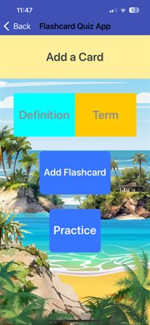
A working Android application, and a study in what not to do in interface and graphic design for accessible learning.

The problem

I built a flashcard quiz application for graduate students, in which a user creates cards carrying a term and a definition, stores them, practices them, and removes each card once it is learned.

The choice of application was deliberate. Flashcards are retrieval practice, and retrieval practice is one of the very few study behaviors with strong evidence behind it. It is also what my own research later identified. When I tested short instructional videos against text, the video group reported higher satisfaction and scored lower on the quizzes, and the most sensible explanation is that watching can feel like learning while doing less of it. A tool that forces the learner to produce the answer rather than recognize it is the direct countermeasure. The second problem was simpler — I had never built a mobile application, and I wanted to find out whether I could.

The decision

I chose MIT App Inventor, which uses block-based visual programming, and I began the way I would want any learner to be able to begin, with tutorials, tool guides, and example builds, following one closely before customizing.

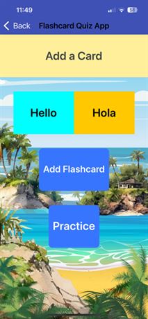
I designed the interface first, in the Designer view, then built the functionality in the Blocks view — a TinyDB store so cards persist between sessions, the variables, and the conditional logic for adding a card, removing a card, and notifying the user when the deck has been fully reviewed or is empty. Block-based programming looks simpler than text-based programming and is not, particularly once the conditionals begin to nest. I tested continuously using App Inventor’s AI Companion, which mirrors changes onto a connected device live, so the interface was checked against a real phone rather than against a canvas.

The proof

The application works. A user can create a card, store it, practice it, be notified when the deck has been fully reviewed or is empty, and have the cards persist between sessions.

The moment I would put in front of a hiring manager is a different one. While testing on my own device I encountered a persistent error, and rather than assume I had made a mistake in my build, I investigated it. The error turned out to be specific to the iOS version running on the device rather than to my application. Knowing the difference between your bug and the platform’s bug is not something you can by watching tutorials - it comes from my professional experience working with enterprise IT systems and solving IT problems.

What the screens teach

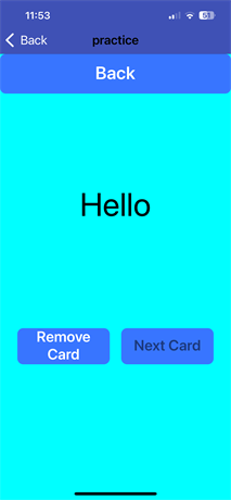
I chose a high contrast, fun color scheme for these screens that I thought the students may enjoy. However, the accessibility measurements point to a real problem. These measurements are worth publishing, because they are a compact lesson in four mistakes that make an otherwise functional learning interface unusable.

Contrast. The Term and Definition controls place white text on bright cyan at 2.27:1, and on gold at 1.78:1. WCAG 2.1 AA requires 4.5:1 for body text and 3:1 for non-text elements. A palette can look vivid, bright, and fun and still fail by a factor of two.

A photograph behind the controls. A tropical image sits under the buttons and competes with them for attention. A decorative background has no contrast floor of its own, so every control placed on top of it inherits whatever the photograph happens to be doing at that pixel.

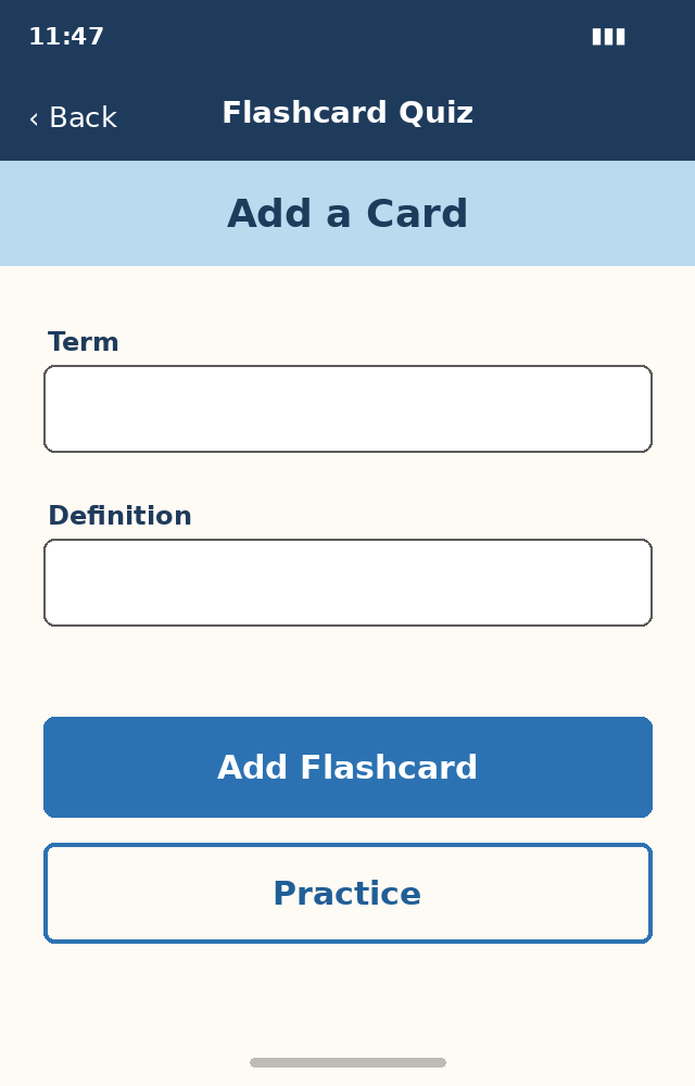
Placeholder text in place of labels. The fields carry their names as placeholder text, which disappears the moment a learner types, and which a screen reader may not announce as a label at all.

Color alone carrying meaning. The two controls are distinguished by fill color rather than by shape, label weight, or position, so the distinction disappears for a learner with a color vision deficiency.

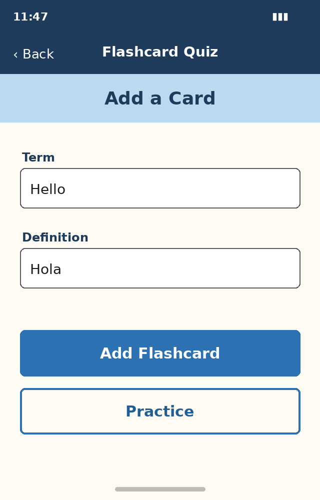
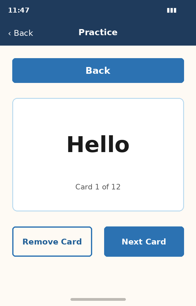
The redesigned screens beside these apply the fix. Visible labels sit above every input, a flat surface replaces the photograph, controls are distinguished by more than color, and the palette is the one this site uses, where the lowest measured text pair is 5.05:1 and every pair meets the accessibility standards.

The redesign shows the specific moves that can turn an inaccessible screen into an accessible one — label the field, flatten the ground, distinguish by more than hue, and always measure accessibility in your learning designs rather than trusting the eye.

As built

The interface as shipped. The contrast issues described above are visible here and have not been corrected.

Proposed redesign

A proposed redesign, not a shipped build. Visible labels, a flat background, controls distinguished by more than color, and this site’s palette, where the lowest measured text pair is 5.05:1.

Artifacts

  • Original interface screens — shown above
  • Proposed redesign screens — shown above